This is part 2 of our 12-part series “This is Product-Led,” inspired by our conference for Gainsight PX users, Pulse for Product.
All retro gamers know that you can’t just be dropped into a video game without any instruction. Instead, nearly all games begin with what’s known as an opening sequence—an 8-bit video that sets up the story followed by an easy level where you can practice. Product leaders should all take note.
In-app engagements are like opening sequences for applications, and a fantastic way to familiarize users and decrease churn. Today, they’re basically expected and can have a huge impact on revenue. When Sarah Anderson, Head of Product at Email on Acid, ran a test with a sample group, they found that in-app engagements led to 15% higher retention. Yours can too.
What Are In-App Engagements?
It’s a rare software these days that’s built to explain itself. It isn’t part of the product design workflow. But when application developers and designers assume that users know what they’re looking for, how to find it, and how to use it, it creates spotty experiences that cause frustration and lead to churn. Those first days and weeks of a new user’s journey are crucial—it’s where the real first impression is made.
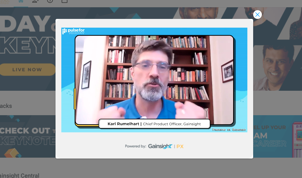
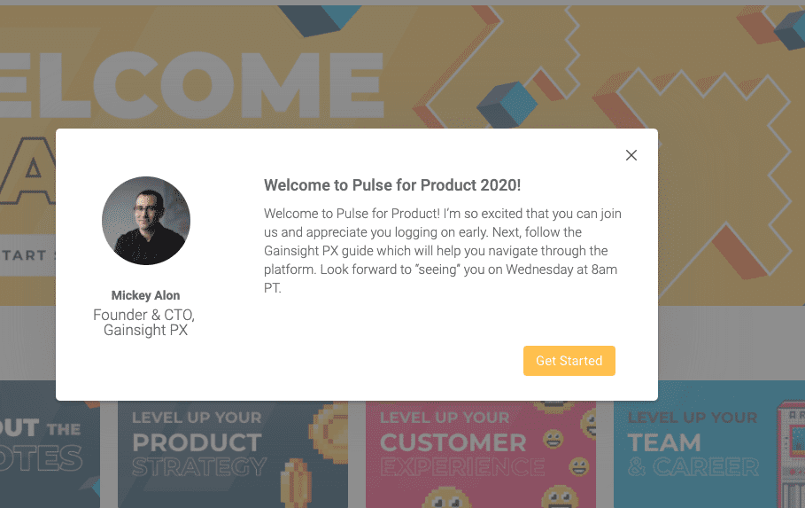
To bridge the gap and educate new and existing users, there are in-app engagements. These are notifications, badges, guides, walkthroughs, and takeovers that explain how the application works, sort of like someone leaning over your shoulder and pointing.


Sample Gainsight PX Engagements
Creating engagements is easy. But creating useful ones? That’s a bit more difficult. Many product teams tend to overdo it, and that can have the opposite effect. “You have to ensure customers come away from in-app engagements saying, ‘Wow, that was valuable,’” says Sarah. “We put our customer at the core of these decisions 100% of the time, and that’s how we get engagements that make people say, ‘I’m going to pin this for later.’ Otherwise, the danger is your risk of becoming a distraction.”
If your notifications and guides are seen as a distraction, it can do long-term harm. The most important channel for communicating with customers is often the product itself. With all the digital noise, you can’t assume your emails are opened and read. The best place to reach people is right in-context, with a pop-up or notification. If you build in-app engagements that are tone-deaf or unhelpful, you teach people to ignore this channel, and close pop-ups without reading them.
To avoid this fate, there’s in-app engagement segmentation. That’s when you target someone with engagements based on who they are and what stage of the journey they’re in.
“Customers don’t care about what your data models look like,” says Sarah. “They care about whether you’re hitting them where they’re at in the journey. If you send a power user a ‘Use this new feature’ notification and they say, ‘Hey, I’m one of your people. What gives?,’ you’ve lost them. But if you send the notification only to those users that want to hear it, you create an invisible hand that guides everyone to their value action. That’s the power of segmentation, and that’s the power of Gainsight PX.”
What Are You Waiting For?
Sign up for a free trial of Gainsight PX and select from a series of in-app engagement templates you can start sending today. And even better, sign up for Gainsight PX to see how we use PX to onboard people onto PX. You’ll be guided in ways that might give you new ideas for your own customers.
Like video game opening sequences, in-app engagements are helpful, expected, and necessary. But unlike video game sequences, they don’t take weeks to code. Spin one up today and see for yourself—it’s one of your best tools for increasing retention.
Level up your product strategy—Try Gainsight PX free!
