This is part 10 of our 12-part series “This is Product-Led,” inspired by our conference for Gainsight PX users, Pulse for Product.
Throughout this series, we’ve used retro gaming to explain product-led growth and product analytics. In this post, we stray into the early 2000s to discuss a slightly newer game, Halo: Combat Evolved, because the coincidental similarities between that game and Adobe’s Pulse for Product presentation is simply unreal.
As the player of Halo, you’re dropped into an alien world where you must fight your way out of traps and puzzles. It is sometimes disorienting but there’s a narrator that keeps you going—a friendly, glowing blue little dot robot named 343 Guilty Spark. He floats ahead of you, showing you the way.
In their presentation, Tim Lott, Director of Experience Cloud Integration at Adobe, and John Bates, Director of Product Management at Adobe, explained how they launched their own blue dot “robot” to guide users within Adobe Analytics.
Follow the Glowing Blue Guide
Adobe Analytics is a mature product used by businesses with as wide-ranging use cases as Ben & Jerry’s Ice Cream to British Telecom. As such, Tim and John’s teams are always looking for subtle ways to increase its utility without suddenly changing the interface in ways that would confuse its many users. When they launched a new feature that allowed users to compare date ranges, it sparked an internal debate.
They knew they wanted to use a subtle, pulsating, pale blue dot, powered by Gainsight PX, to draw people’s attention to the new button. But how “loud” should the dot be? And should they show it to everyone or just those who they thought would be a good fit?
“I would say the new feature button was fairly buried in the user experience,” says John. “It took a number of clicks to get there, even though users highly valued it and there was a demand for it.” So Tim and John launched a test to validate their two hypotheses:
Hypothesis 1: Displaying in-product tour guide (announced by the dot) to promote awareness of the feature would increase adoption.
Hypothesis 2: Model-based targeting (using a propensity data model to pick people who are likely to be a fit) was a more effective way to identify users who were likely to benefit from this feature than showing it randomly.
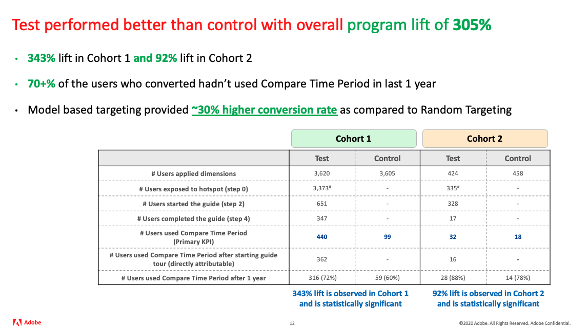
For the model-based targeting, they selected roughly 1,700 users for each cohort—test and control—and over a period of a few weeks, displayed the blue dot. For that time, like players of the video game Halo: Combat Evolved, users of Adobe Analytics got a little pulsating robot guide who, if they clicked it, led them through a series of steps to understand how to compare time periods.
The result was inspiring. The guide increased people’s propensity to use the new feature by 305%. But what was more, the model-based approach improved those results even further.
The model led to a 343% lift in usage. And that brings us back to where we began—talking about Halo’s coincidentally named “343” Guilty Spark.

Users Want a Glowing Blue Guide
Whether it’s a video game or an analytics suite, people appreciate a pleasant, blue, pulsating guide to help them through. Good game developers and product designers know this and implement guides for much the same reason.
For product teams, even if you didn’t plan for this in your product, you can implement it just the same using product analytics.
Curious what a 343% lift in usage could do for one of your new features? Grab a free trial of Gainsight PX (or a copy of Halo: Combat Evolved) and see for yourself.
