In-app messages are popping up everywhere and SaaS products are no exception.
In-app engagements is a highly effective way to increase user retention and engagement. In fact, products that use in-app engagements see a 3x boost in engagement and a 4x increase in conversions. An in-app engagement can take many forms such as a guide, survey, or notification.
Effective user engagement is an art and a science. People expect a highly personalized product experience and can easily switch to one of your competitors if they don’t feel their needs are being met. Timing, placement, tone, and volume all need to be taken into consideration.
Here are nine ways SaaS products are using in-app messages to drive user engagement.
Salesforce
Engagement Type: Product Update
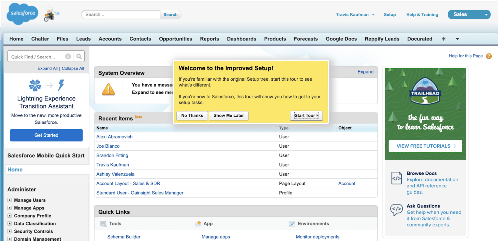
A new interface can really throw off your user’s groove. Getting acquainted with a new workflow can make users feel like they’re losing productivity, but providing in-app messaging and guides can make the process way less frustrating.
Salesforce used this in-app message to notify users of their improved setup. It also gives them three different call-to-actions (CTAs): No Thanks, Show Me Later, and Start Tour. It’s important to note that the messaging speaks to both old and new users and addresses their individual needs for the tour that’s provided. Personalization doesn’t have to be ultra-targeted, sometimes just including all possible segments in one clear message will do the trick!
Hubspot
Engagement Type: Product Status Notification

When your product isn’t performing at 100% it’s incredibly important to let your users know what’s going on behind the scenes. These are potentially frustrating experiences but if you can get ahead of it, users will know what to expect and that you’re actively working to fix it.
Hubspot hits both of these with their detailed in-app notification addressing processing delays. The CTA is also a key element and gives affected users a means to find more information. Pro-tip: Once your issue is resolved, close the loop by sending out an email to bring users back into your product.
Marketo
Engagement Type: Product Adoption
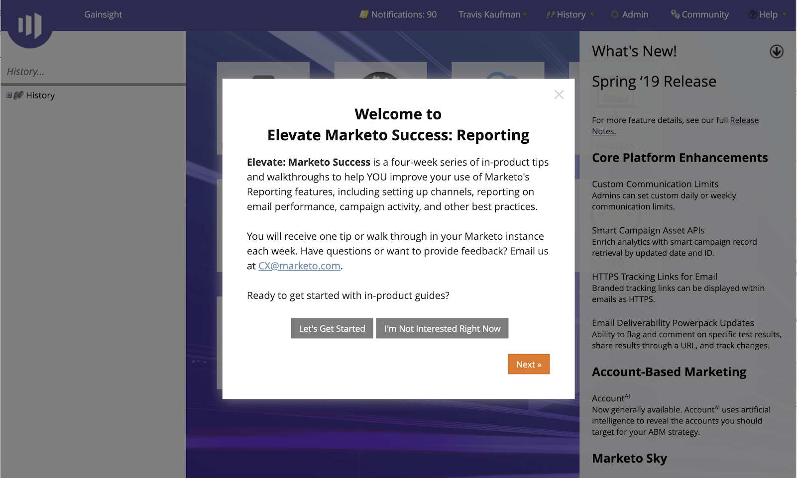
At Gainsight, we believe that cultivating lifetime customers requires two things: value from your product/service and a great experience throughout the customer journey. This in-app notification from Marketo drives both.
Complex features can be big hurdles for new users. If they’re not comfortable using a feature, they will never get the full value it can provide. Reporting is a huge component of Marketo’s value proposition but it can also be daunting if you’ve never used a similar tool. This in-app message is a good example of how you can reach out to users while they’re in a specific feature to offer them something relevant. It’s a great experience for the user because they’re getting help when they need it and it leads to successful outcomes because it’ll make the user more adept at that feature in the long run.
Google Drive
Engagement Type: Product Adoption
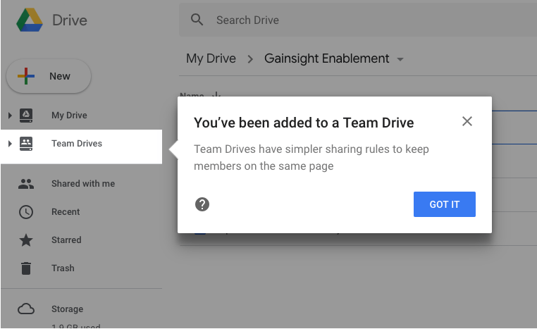
Onboarding is a make-it-or-break-it moment for your product. If your user doesn’t feel comfortable using your product or know the extent of its capabilities, they’ll never realize the full value. Effective in-app engagements will help create habits in your users, so they become integral to their workflow.
Google Drive facilitates (and relies on) collaboration between users. This in-app message is triggered at a critical moment: when a user is added to a Team Drive. It calls attention to the feature and explains its functionality. Now the user knows where to go to access shared Drives.
Wells Fargo
Engagement Type: Product Adoption
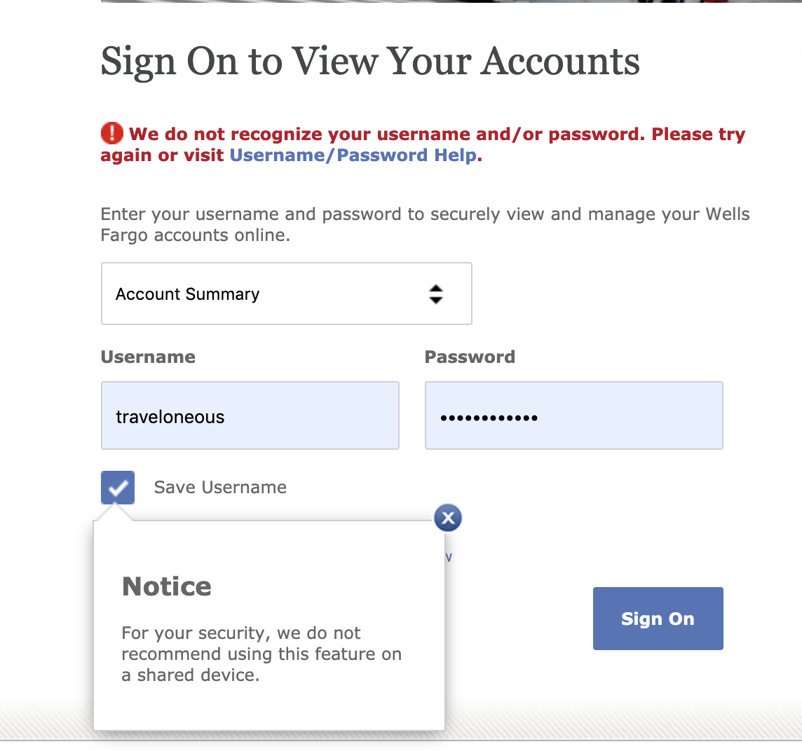
Ahh, the classic “don’t do this on a shared device” notification. We admit, this one isn’t a SaaS product, but it’s a notification everyone is familiar with (unless you’ve never entered in a username and password in your life, which we find very hard to believe).
This type of in-app message can go unnoticed when you don’t need it but is a helpful reminder when you do. It builds trust with your users and is a small way of conveying that you have their best interests in mind, from the get-go.
Turbo Tax
Engagement Type: Feedback
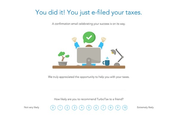
This in-app survey on Turbo Tax is an example of perfect timing when asking for feedback. When you ask for NPS directly after a feature is used, the experience is still fresh in a user’s mind. It’ll give you the most accurate sentiment. To get this instant feedback, it’s important that the survey is directly within the app. If you’re triggering NPS surveys to send via email, by the time it gets to them it’s too late. They either won’t look at the email or have rethought their experience by the time they take the survey.
Hubspot
Engagement Type: Promotional
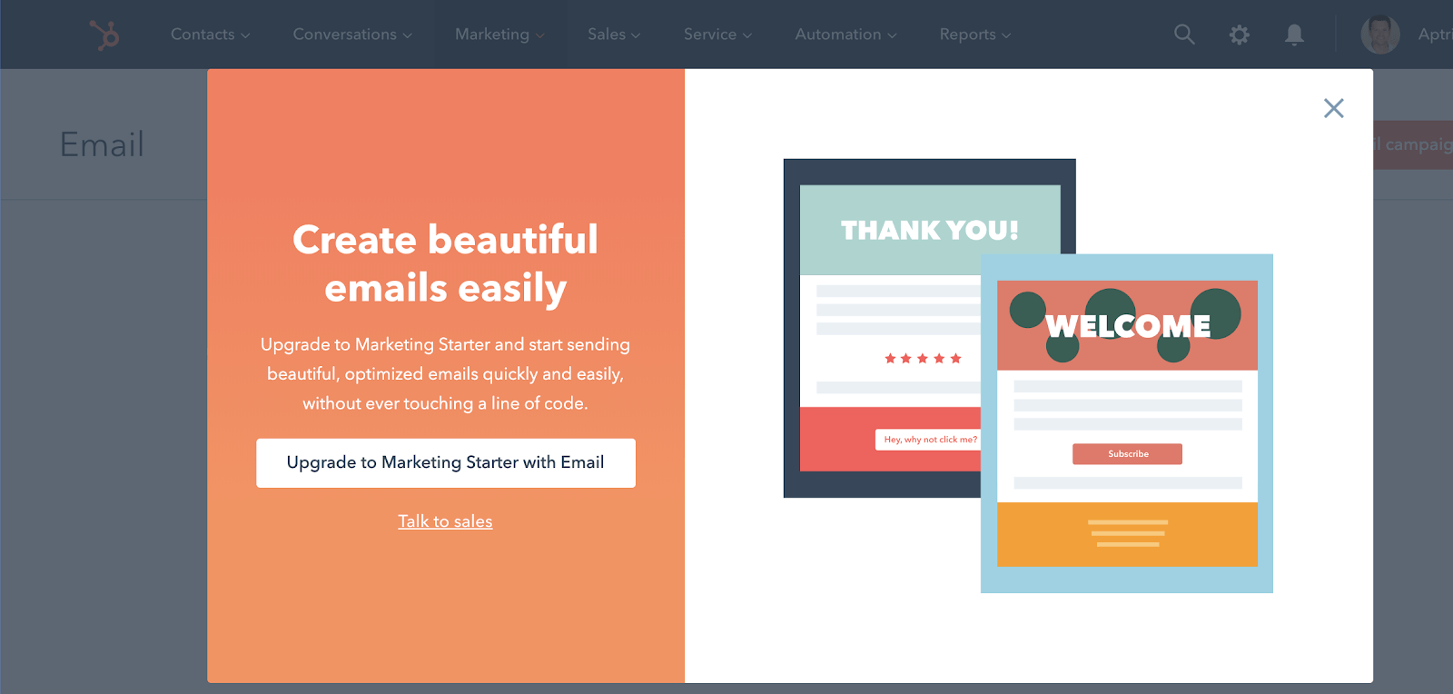
If you want your product to drive growth, you need to embrace the idea of selling within the product. To ensure these in-product promotions don’t detract from the product experience, you should make them as targeted as possible.
In this Hubspot example, they’ve determined that people using the Email feature will be interested in this upgrade. The promotion is relevant—users who receive it will at least be intrigued by the idea of “beautiful, optimized emails” that require no coding. What’s more, the CTA button gives the idea that upgrading will be quick and easy. But, if they need to talk to Sales, they also have that option.
SurveyMonkey
Engagement Type: Promotional
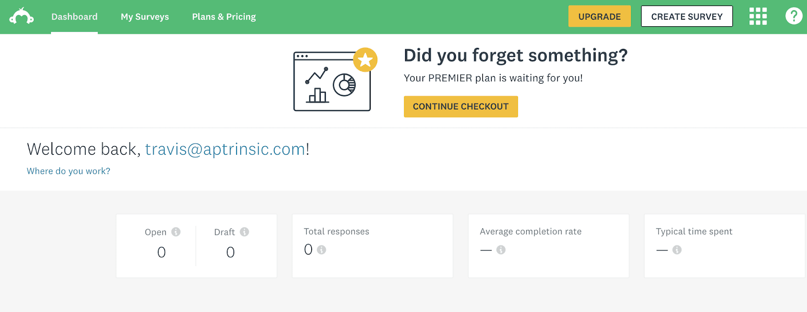
SurveyMonkey is the poster child for product-led growth. Anyone can use SurveyMonkey to create a free survey but if you want to unlock more powerful features and analytics, you have to pay. The question is, how do you push someone from a free trial to a paid contract? Four words: perfectly timed in-app engagements.
“Did you forget something?” is a common and effective in-app message. If you’ve shopped online, you’ve likely run into it. It’s a gentle push with a clear CTA that brings the user back into the checkout flow to finally close out the transaction.
Trello
Engagement Type: Product Update
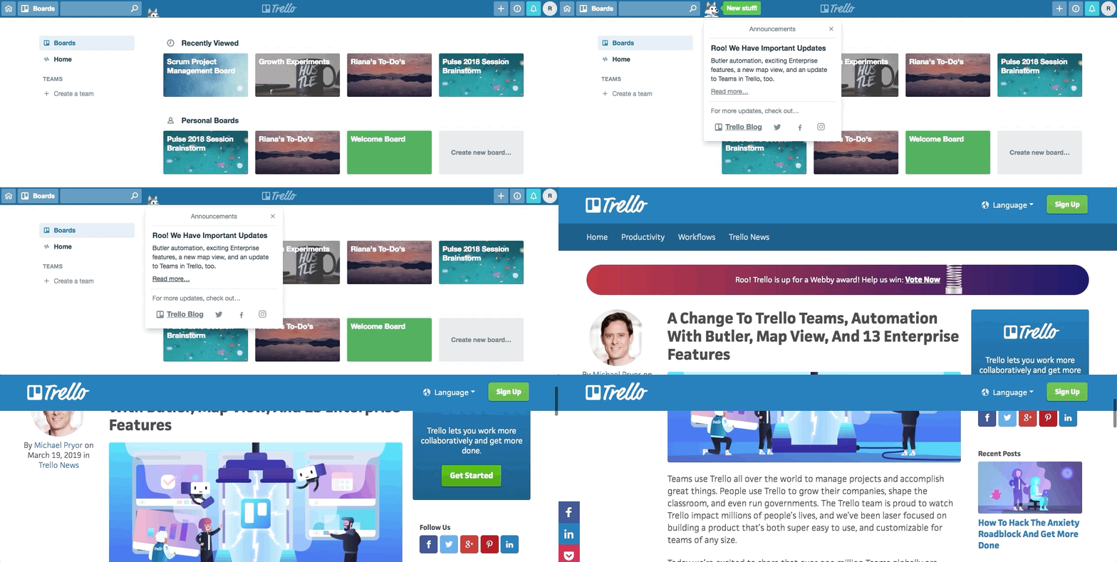
In-app notifications for product updates are a great opportunity to be creative! The more creative, the more noticeable—and it’s a perfect way to strengthen your brand.
Users of Trello are familiar with the company’s spoke-husky, Taco. In this example, they’ve used Taco as a fun way to grab your attention and share product updates. Hovering over Taco makes his head pop up and clicking on the pop-up brings users right to a blog post covering the new additions. It’s a seamless process that’s useful and infused with child-like joy.
Take User Engagement Into Your Own Hands
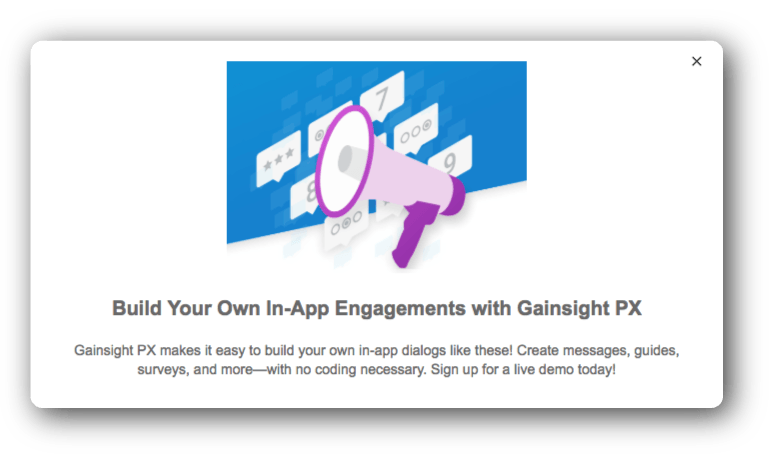
You can build in-app notifications like this one in Gainsight PX with just a few clicks and no coding required. Our platform will also make sure that the right people get the right messages. With Gainsight PX you can create messages and segment to your heart’s content and make a significant impact on adoption, engagement, and growth. Join us for a demo so you can see Gainsight PX in action!
