The Complete Guide to Mapping and Optimizing Critical User Journeys
Struggling to grow your user base? Try mapping out your critical user journeys.
This is the approach that teams at Google and Pinterest use to reignite growth. Critical user journeys enable you to visualize aspects of a user’s experience that impact business revenue and customer satisfaction.
In this guide, you’ll learn what critical user journeys are, how they are used, and how you can create and improve your critical user paths to grow your product.
TL;DR (too long, didn’t read):
- Critical user journeys are used to reignite growth.
- They enable you to visualize aspects of the user experience that impact revenue and customer satisfaction.
- They can be used to drive alignment, decrease churn, and increase customer loyalty.
- In this article, we spend some time focusing on different types of critical user journeys: high-traffic, high-dollar, and overall evaluation criterion (OEC).
- The main difference between critical user journeys and user experience maps is the narrowed scope of a critical user journey.
- Driving user adoption and setting users up for success is paramount to improving a critical user journey.
Summary of key critical user journey concepts
Here is a quick overview of the key concepts.
| Concept | Explanation |
|---|---|
| What is a critical user journey? | A critical user journey is a series of interactions that your users have with your product. |
| When are critical user journeys used? | Critical user journeys are used when introducing a new product or feature or any time an existing journey needs improvement. They can also be used at different stages of the customer lifecycle (e.g., awareness, retention, etc.). |
| How are critical user journeys used? | They are used to improve user experience, drive company alignment, decrease churn, and increase customer loyalty by highlighting points of friction or “aha moments.” |
| What are the types of critical user journeys? | Critical user journeys can be categorized into three different primary types: high-traffic, high-dollar, and overall evaluation criterion (OEC). |
When are critical user journeys used?
Critical user journeys are typically used to improve the product, enhance product metrics, and create team alignment.
- Product improvements: When there’s a need to develop a new product, feature, or enhancement, a critical user journey can be used to identify where to focus or promote the improvements.
- Team and business alignment: Critical user journeys can be used to drive cohesiveness across teams by allowing them to visualize current customer interactions, identifying areas of success and failure.
- Improving product metrics: A critical user journey map is a great starting point for identifying what influences metrics like activation rates, retention, and churn.
How are critical user journeys used?
Critical user journeys are used to highlight points of friction and moments of delight in an experience. They show the necessary steps a user must take to complete their goal.
Armed with insight into what can negatively and positively impact the journey, you can use a critical user journey to:
- Improve the user experience: Knowing the main areas of friction in the journey allows you to focus on solutions that fix these pain points.
- Improve customer satisfaction and revenue: Customers who are satisfied with the experience are more likely to be retained. Increasing customer retention rates by 5% increases profits by 25% to 95%.
- Decrease user churn and increase customer loyalty: Optimizing the portions of the user experience that impede users from achieving their goals can lead to repeat business.
- Drive company and team alignment: Achieving team- and business-wide cohesiveness allows individuals and departments to work toward a common goal, resulting in greater autonomy and productivity.
Types of critical user journeys
As mentioned above, the three main types of critical user journeys are high-traffic, high-dollar, and overall evaluation criterion. Each can benefit your business in a different way, so let’s dive in!
High-traffic critical user journeys
High-traffic user journeys have a high level of user volume (e.g., SaaS landing pages navigating to demo requests) or lots of interactions (e.g., core product features like sending an email or creating a survey).
These are the journeys you’ll want to optimize for the “aha moment”: the point at which a new user realizes the value of your product.
High-dollar critical user journeys
These are the journeys that either generate the highest revenue or put the most revenue at risk. For example, the checkout experience is the touchpoint that likely creates the most revenue for an ecommerce company. Issues with this portion of the product can result in significant risk to this company’s ability to generate revenue.
For a B2B SaaS product, this journey can be the path from a trial sign-up to a subscription.
Overall evaluation criterion (OEC) critical user journeys
The OEC critical user journey, also known as “the one metric that matters most,” focuses on the journey that improves your business OEC. An OEC is a metric that measures user satisfaction and long-term business value.
Ultimately, when you aim to optimize your OEC critical user journey, you’re aiming to increase user satisfaction while delivering long-term business value.

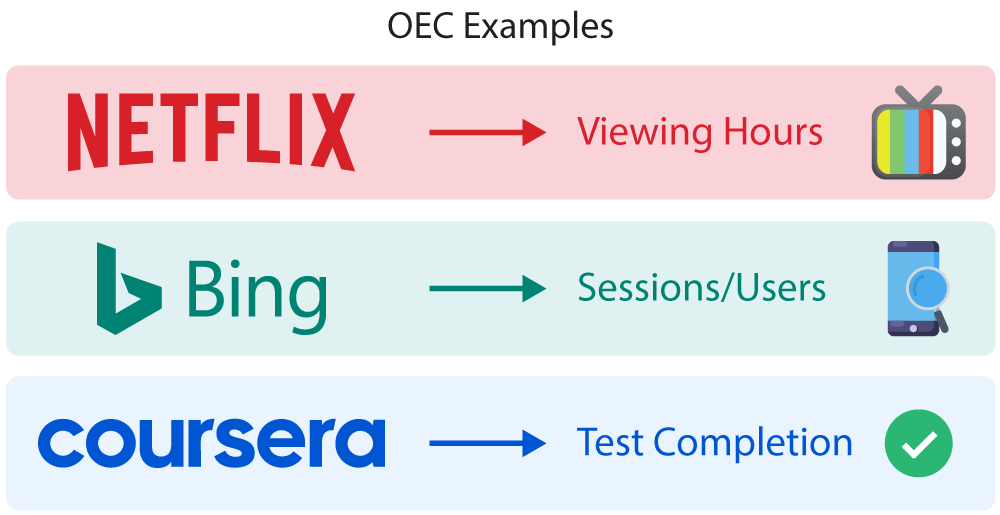
Overall evaluation criterion examples
The difference between high-dollar and OEC critical user journeys
Let’s examine a real-life example. The team behind Bing, the second-largest search engine in the world, started by focusing its goals on increasing queries per unique user. The Bing team rationalized that more queries per user would result in more ads shown, ultimately increasing revenues.
The result, however, was not what was expected. Focusing solely on high-dollar critical user journeys drove users to execute more searches to find the content they were looking for, thereby decreasing user satisfaction.
When the team at Bing shifted its focus to sessions per user, the result was an increase in user satisfaction, leading to more revenue.
What can we learn from this example?
Users who return for multiple sessions with your product likely have higher levels of satisfaction, leading to more retention.
When users returned to Bing over multiple sessions, they naturally saw more ads, which led to more revenue for the business unit.
Put another way, the OEC critical user journey drives a balance of user satisfaction and business revenue.
Critical user journeys vs. user experience maps
Critical user journeys and user experience maps are similar in nature, so it’s easy to confuse them. However, there are some key differences between the two to keep in mind before creating a map.
A critical user journey map is tied to a business goal and has a specific focus on a “critical” aspect of a user journey.
A user experience map is more general, visualizing the entire end-to-end journey of an average user. These maps are typically used to create a baseline understanding of user needs and behaviors.
| Critical user journey map | User experience map | |
|---|---|---|
| Tied to a business goal | ✔️ | ❌ |
| Generalized view | ❌ | ✔️ |
| Focuses on a specific aspect of the experience | ✔️ | ❌ |
| Maps entire end-to-end experience | ❌ | ✔️ |
| Identifies customer pain points | ✔️ | ✔️ |
There are advantages and disadvantages to using either, but both should be perceived as tools used for an intended purpose.
Creating critical user journey maps
Mapping a critical user journey can be broken down into five steps:
- Get stakeholder buy-in
- Select the journey stage
- Narrow the scope
- Identify the “happy path”
- Map the journey
Let’s get started!
1. Get stakeholder buy-in
Buy-in from stakeholders can lead to a better understanding of how journey maps will impact them and their teams. At times, this can encourage other teams to devote resources to the project, increasing successful outcomes.
Likewise, a critical user journey map may reveal unexpected results, so it’s important to come to consensus with stakeholders on why journey maps are important and which journeys are the best candidates for mapping.
Potential stakeholder teams include product leadership, marketing, sales, customer success, and support.
2. Select the journey stage
Unlike user experience maps, critical user journey maps zero in on an aspect of the journey, focusing on a specific stage of the customer’s lifecycle.
One popular tactic for defining a customer lifecycle is to use acquisition, adoption, retention, and expansion categorization.
Begin by answering the following questions:
- Are your current goals to improve product engagement, revenue, or the overall user experience? The answer will help you understand which critical user journey to focus on: high-traffic, high-dollar, or OEC.
- Which stage of the lifecycle has the highest impact on traffic, revenue or user experience?
- Which stage of the journey impacts your business objectives the most?
3. Narrow the scope
User journeys can be complex, but narrowing your scope can drive clarity.
Consider the number of touchpoints within the journey. If there are more than three, it’s best to narrow your focus to a specific aspect.
As an example, for a new user, you would primarily focus on the critical journey of getting to the “aha moment,” the one where the user realizes your product’s value. On the other hand, a retained customer critical journey may focus on encouraging referrals and discouraging churn.
4. Identify the “happy path”
The “happy path” is an error-free path that your users take to get to their end goal. This is the reason why they chose your product in the first place.
Here are some quantitative research methods you can use to identify the “happy path”:
- Funnel analysis allows you to visualize the series of events and steps users take toward a defined goal, like a successful sign-up. In addition, funnel analysis can highlight points of friction, since you will see where along the “happy path” users dropped off.
- Path analysis, much like funnel analysis, allows you to also visualize the series of events and steps a user takes in your product. However, the steps are not predefined and allow you to discover common user journeys or where users are deviating from your defined “happy path.”
- Customer surveys used throughout a critical journey enable you to quantify satisfaction (CSAT), effort (CES) needed to complete a goal, or loyalty (NPS). These are all important signals to consider when mapping a user’s “happy path.”
5. Map the journey
With stakeholders on the same page and key insight in hand, you’re ready to visualize the critical user journey with a map.
Start with a template that suits your needs. Luckily, there are plenty to pick from. Here are our recommendations:
- Customer user journey map by Miro
- Customer user journey template pack by Miro
- UX journey map template by Nigel for Figma

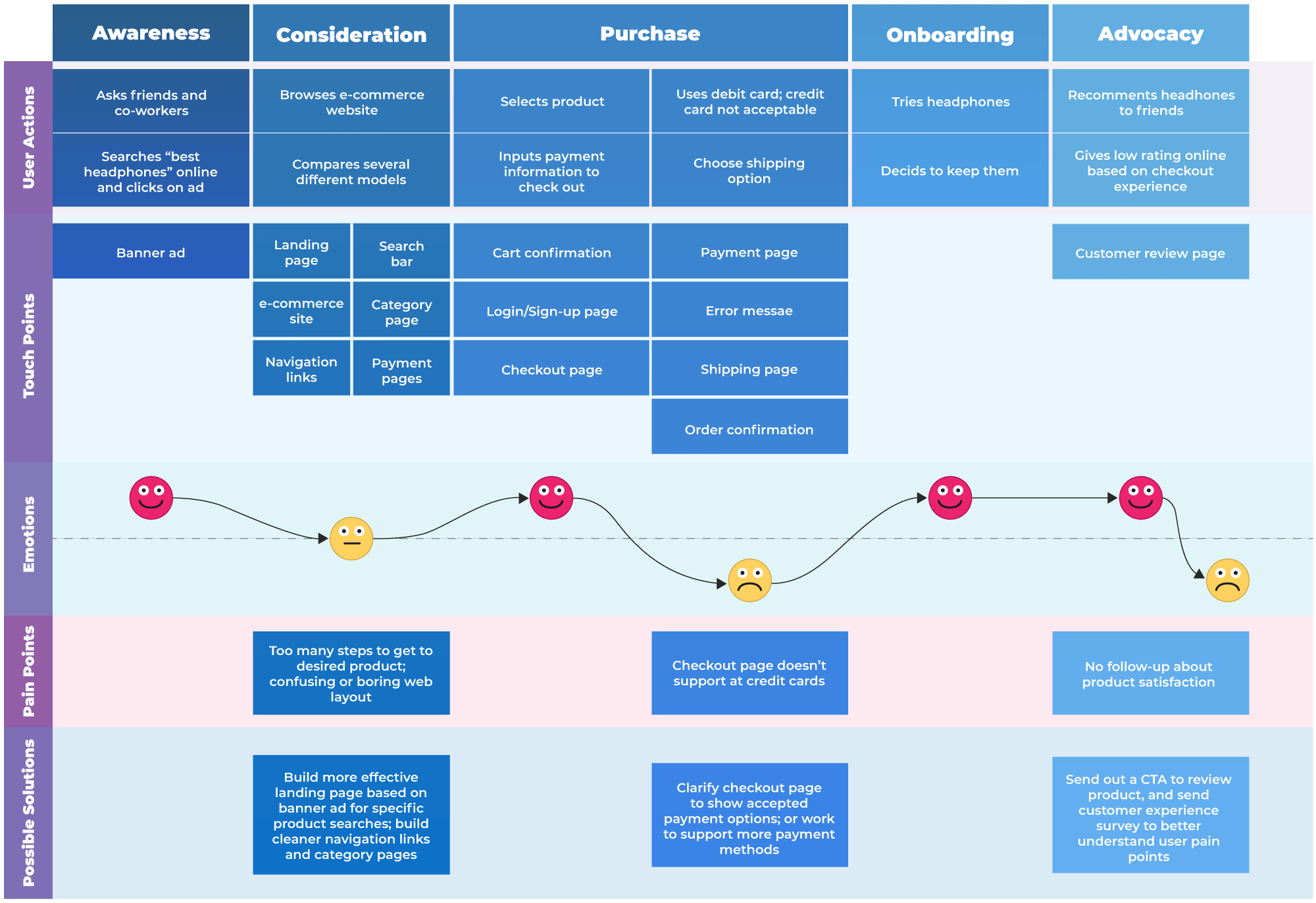
Customer journey map example in Lucidchart (free download here)
Once you’ve decided on what your map will look like, plot the key actions and events that define your user’s critical journey. Leverage funnel analysis to highlight key pathways and dropoffs. Overlay CSAT, CES, and NPS scores to provide additional context for delight and points of friction in the journey.
Best practices for creating and improving critical user journey maps
Ready to create your first critical user journey map? Here are a few tips and best practices to help you get started.
Take steps to get stakeholder buy-in
Getting buy-in is easier said than done. Here are some tips that can help:
- Engage stakeholders (product leadership, marketing, sales, customer success, and support) as early as possible in the process.
- Provide clarity on how the work affects they stakeholders and connects to what they find important.
- Provide reassurance by identifying risks and showing how they’ll be mitigated.
- Set expectations by clearly articulating the goal, what you expected from the stakeholders, and how they’ll benefit
Segmentation and propensity scores
Segmentation and propensity scores can assist in narrowing the focus of your critical user journey maps by reducing the pool of users (or traffic) to analyze.
For example, you could segment traffic from your funnel analysis that has a low propensity for becoming customers. Doing so could be useful in reducing noise from data and making “happy paths” easier to identify.
Understand users and how they define success
To ensure that users can complete their goals, we need to understand their definition of success. Ask each new user what they value and what they’re trying to achieve with your product or specific feature. This will provide insight into their functional goals (e.g., saving time), personal goals (e.g., feeling empowered), and social goals (e.g., impressing the boss).
Utilize the TRUSt framework
To ensure that communication is highly valued, and even welcomed, it’s best to utilize a consistent framework, such as the TRUSt framework:
- Timely
- Relevant
- Useful
- Straightforward
The TRUSt framework provides structure when crafting messages to improve your critical user journeys.
For example, let’s say you’re focused on increasing customer engagement for a new feature. Just follow the steps outlined in the TRUSt framework to develop your messaging strategy:
- Timely: When is the best time to message customers about the new feature? The message needs to be delivered based on the customer’s timing, not yours.
- Relevant: Who should receive the message about the new feature? The message needs to be relevant, taking the customer’s usage patterns into account, i.e., it wouldn’t be relevant for a customer already engaged with the feature.
- Useful: How do you best help your customers with this message? The message must provide value to the customer.
- Straightforward: How do you ensure that the message is clear, concise, and unobtrusive of the customer’s experience? You wouldn’t want to tarnish the user experience with distracting and convoluted messaging elements.
As you devise a communication strategy to improve your critical user journeys, it’s important to remember the outcome you’re hoping to achieve. The TRUSt framework helps craft communications with a purpose, but implementing quality user experiences will further encourage users to follow a journey.
Implement proven UI design patterns
Standard UI design patterns can be a significant driver of product goals. Here are some examples of powerful design patterns that can help guide users and improve their critical journeys:
- Welcome message: A considerate welcome message helps set the tone for your product. First impressions count, and this is your chance to greet your new users.
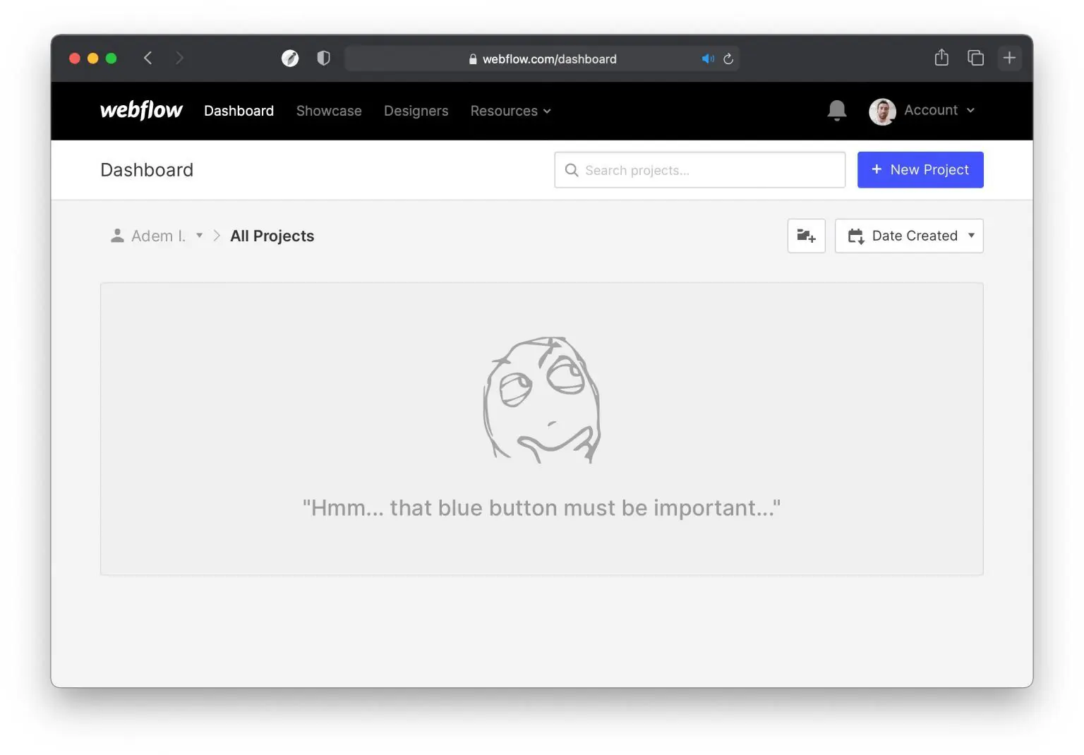
- Empty states: How your product looks before users fill it with their content is referred to as the “empty state.” They can be confusing for new and existing users, often lacking contextual information. Pre-filling content or providing hints within the empty space can offer reassurance by guiding the user through important steps.
 Webflow empty state (source)
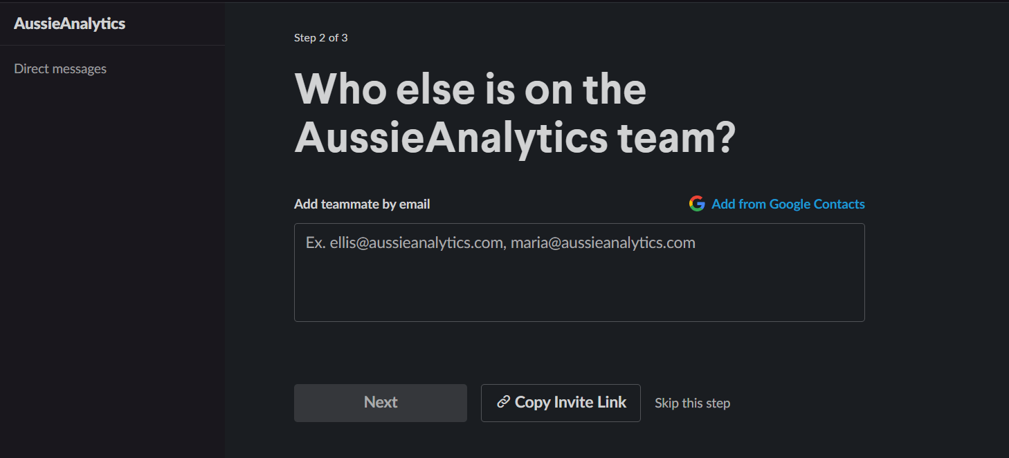
- Inline hints and tips: A subtle but powerful UI pattern, inline hints and tips provide additional information or best practices within elements on the screen. As an example, upon sign-up to Slack, the user is asked to invite teammates. At this stage, a very subtle inline hint shows sample email addresses in the “add teammates by email” field.

Inline hint and tips on Slack
- Tooltips: Labels that provide additional context about UI elements, often triggered when hovering over a hotspot or shown as part of a product tour. Tooltips can be effective for explaining complex features or functionality. Conversely, extensive usage of tooltips may be an indicator that your interface is too complex because a well-designed experience should be self-explanatory.
- In-App Engagements: These are useful for orienting new users and overcoming initial friction after sign-up. In-app engagements get users to take action by pointing out areas of the product that users need to interact with to realize value. An example would be a UI element that drives users toward activating a feature or engaging with a new product release.
 In-app engagement example (source)
Provide contextual content and communication
To be most effective, in-app engagements, welcome messages, and tooltips should be triggered contextually and personalized to each user’s actions (e.g., after they activate a feature or hit a specific milestone).
Utilizing the TRUSt framework for contextual communication can increase the likelihood that your message will be valued by minimizing message fatigue.
Conclusion
Critical user journey maps are a core method for visualizing customer interactions, highlighting moments of delight, and identifying points of friction.
Planning user journeys can create team alignment, build customer empathy, and reignite growth by shining a light on where to focus product development efforts.
Double down on user adoption, customer experience, and revenue by mapping and improving your product with critical user journeys.


