Two weeks ago, we launched the Horizon Experience, Gainsight’s simple, intuitive, and beautiful new product experience. In previous posts, we shared our design values and our approach to implementing the experience. But what happens when you acquire a product that has a completely different user experience? Today I’ll share some thoughts around how we are marching forward toward a fresher, more unified experience in Gainsight PX.
Background
Over the years, Gainsight had become a leader in the Customer Success space, and we were ready to extend our reach to adjacent use cases. In early 2019, we acquired Aptrinsic, a company specializing in tools to better understand and connect with users within the product experience (renamed PX shortly after). We largely made no changes to the look and feel of PX for over a year. The design is fairly modern, uses an energetic color palette, and supports lots of purpose-built interfaces for advanced analytics and engagements.
Our decision to update PX to the Horizon Experience involved many factors and evolved over time. The first factor was our brand. While PX has some extremely powerful capabilities, it lacked the brand presence of the core Gainsight product, creating potential brand recognition challenges. The second was our initiative to scale design. While developing the Horizon experience, the power of working toward our goal as a team was exponentially greater than individuals working alone. If PX remained a disparate experience, our teams would be slowed down by solving duplicate challenges and forfeiting the collection of shared knowledge. Finally, we realized there are many more similarities than differences between PX and CS, and that our CS audience would actually use both tools rather than our initial assumption that PX would mostly be used by a different persona.
Our Approach
Updating PX to Horizon would not be easy. As a smaller team in an earlier stage, our PX engineers had to put most of their focus into iterative learnings and scaling early customers. So, we could not afford to pull the team off of their existing roadmap for a quarter to refactor the user experience. Also, most of the enhancements being implemented were pieces of the existing application rather than entirely new pages that could be launched in a new UI more seamlessly. Here’s how we decided to phase the work to ensure we can achieve some big wins in a short time while continuing to innovate on the PX roadmap as a whole.
Phase 1: Brand Identity and Shell
In enterprise software, it’s important to avoid overbranding your product to avoid clashing with your customer’s brand. Given that one of our top goals for the PX integration was to better incorporate the established Gainsight brand, we looked for ways to move in this direction without inundating customers with components that overpower their identity. To accomplish this, we decided to start by unifying the application header and side navigation styling. This gives users the feeling they are in the same product suite with a very minimal engineering investment and also eliminating the requirement to retrain the user. By adding an expandable element to PX’s navigation, we are also able to support an extra level of navigation, eliminating the need to use valuable space inline, or show users multiple conflicting navigation paradigms in one view.

Phase 2: Incorporating Values
As I mentioned before, the Gainsight Horizon Experience is simple, intuitive, and beautiful. How could we quickly incorporate these values into PX without disrupting the existing experience or our team’s customer roadmap?
First, we simplified. By this, I mean that we went through the application page by page and scrutinized the experience to find things we could eliminate if not necessary to the user. A few examples of what we discovered are the following:
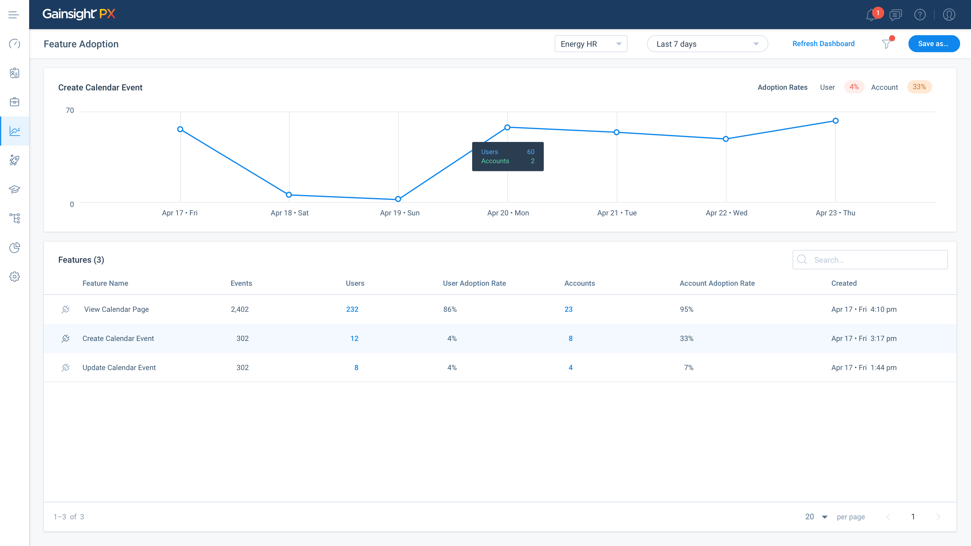
- Eliminate icons on buttons. Icons are helpful when in a confined space with no text, or when the symbol is universal, but our existing pattern called for icons and words on each button. In most cases, we opted to eliminate the icons from our buttons. This also applied to icons next to list items that created too much content for users to sift through in order to accomplish their goals.
- Reduce the default number of columns. In many cases, our tables and lists contained 10+ columns in the default view, resulting in words cut off and information overload. We reduced the default to 6.
- Reduce timestamps and overly granular detail. While information like the time and day of week are important when reviewing usage patterns and analytics, they are not so important for labeling engagements in a list view. For every label, we asked what problem it helped the user solve. If it wasn’t apparent in user feedback, usage data or our intuition, we let it go.
Phase 3: UI Elements and Horizon Style Guide
In phase 3, we implemented the core elements of the Horizon Experience that could be updated in parallel to feature enhancement without causing a bottleneck to our engineers. This included font styles, font colors, link treatment, form elements, in-app messages and the like. We provided the central Horizon Design System specifications to our front end engineers, but more investment would be needed. Since PX was more like a startup, in the early days teams had moved fast to get to MVP; and sometimes components were built in such a way that they were not able to be edited in one sweep. So, we sat with the engineers for a few hours a week to work through the different areas of the application to ensure no details were missed. We also enabled them with a tool that lets them pull CSS attributes directly from our sketch file.
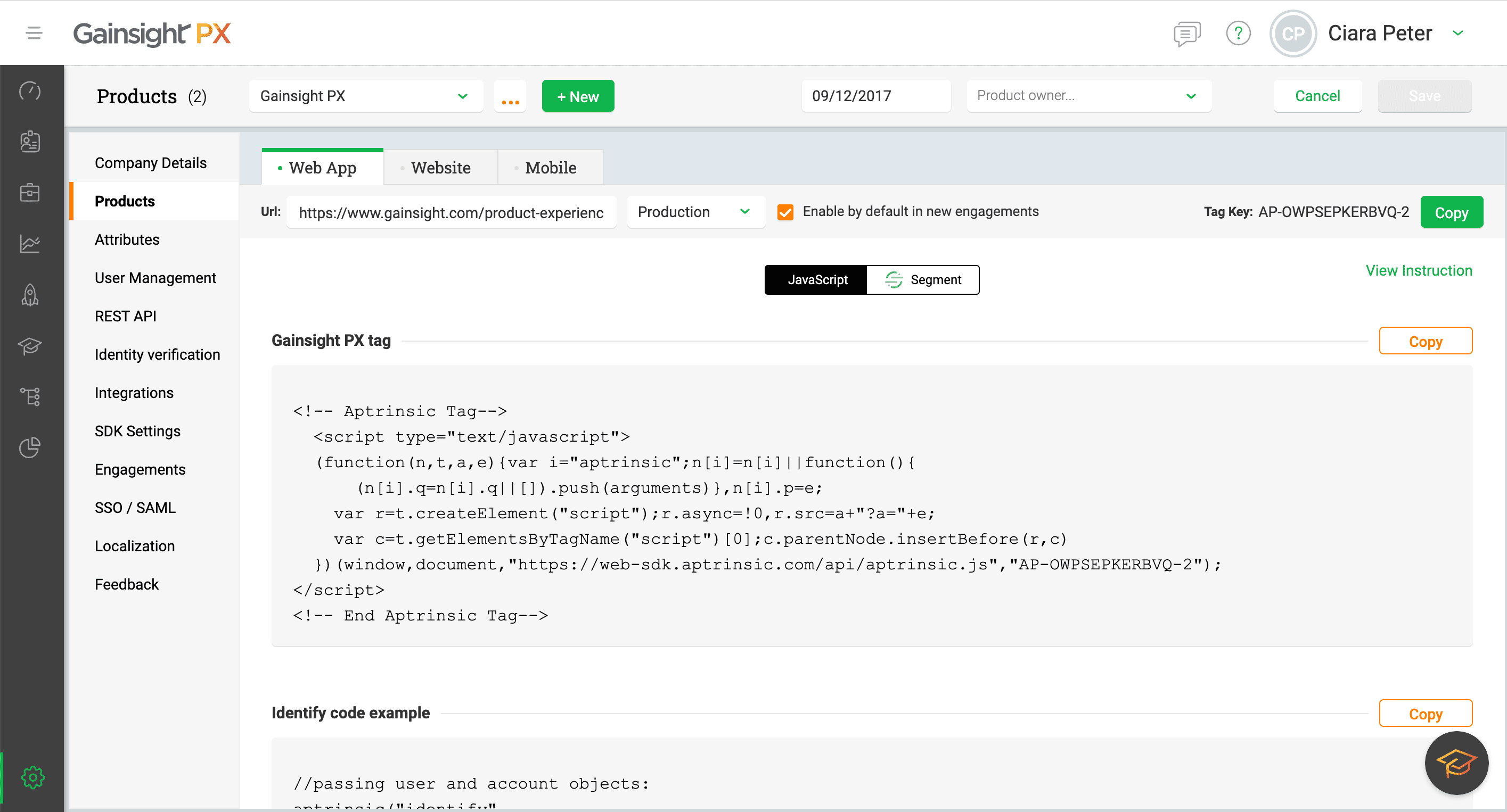
 Gainsight PX javascript ‘before’
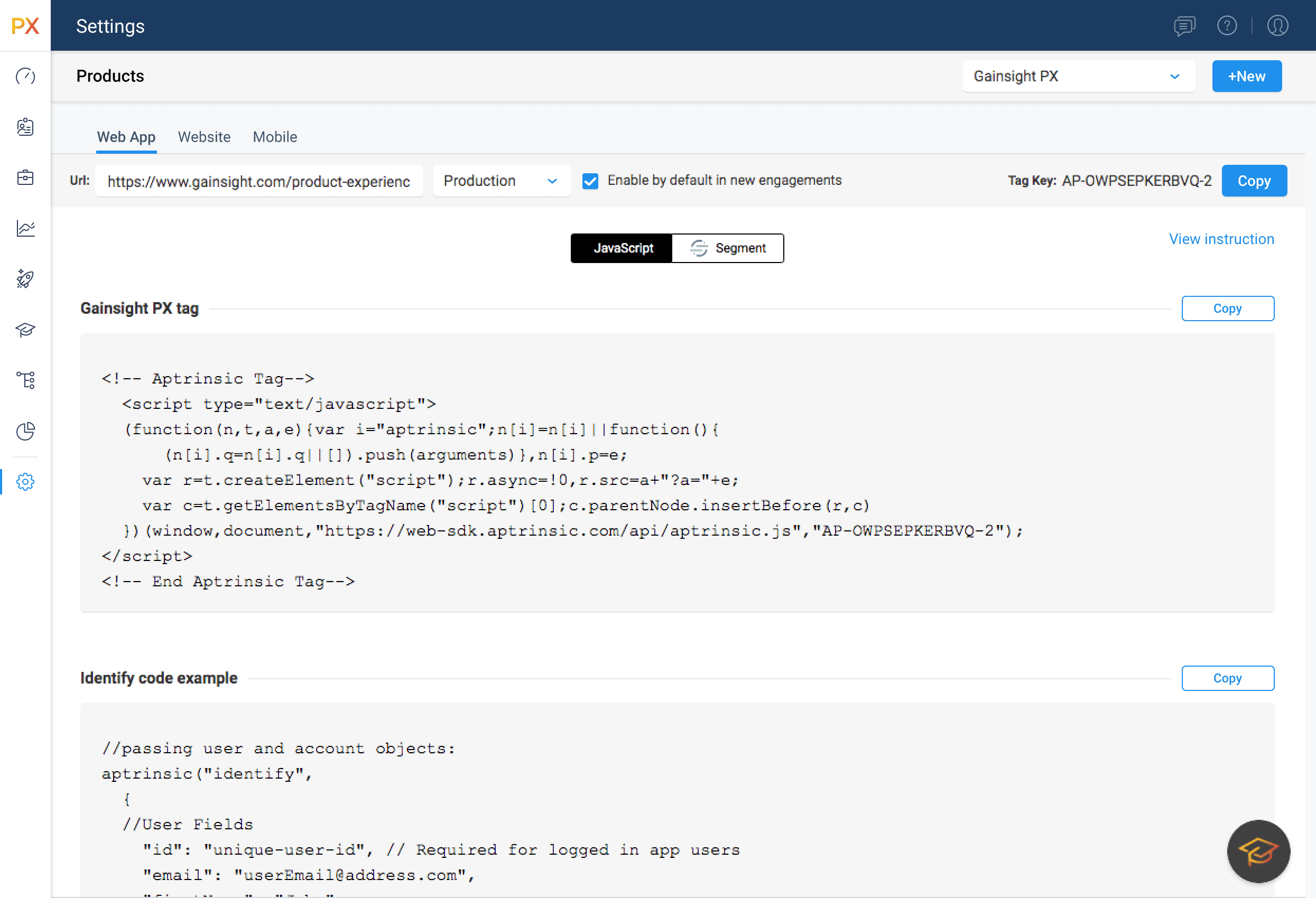
 Gainsight PX javascript ‘after’
Phase 4: The Future
We made great progress with phases 1-3, and we will continue to iterate into the future. As both CS and PX products develop, we now have enough shared knowledge to consider the existing assets and leverage them to reuse in our upcoming designs across Gainsight. In addition, we are also thinking through how to consolidate our login experience across apps, to further unify the product experience. Sharing a philosophy and values across our organization leads us closer every day to the goal of unification.
If you’re using PX, you can look forward to the Horizon Experience starting to shape this Summer.

